s
c
r
o
e
r
Join our community
visualization
@vk6flab
Source
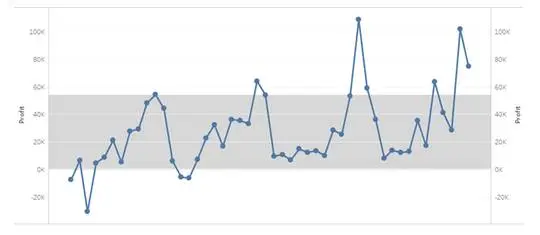
How can I plot a chart like this in gnuplot that displays a "normal" range with test results overlaid?
0
0
Auto
More like this
Home
Discover
Upload
Collection
Login